Brand Kit
Everything you need to represent iBnk correctly — logo, colors, and typography. Please keep our marks intact and follow the simple guidelines below. For anything not covered here, reach out to contact@ibnk.xyz.
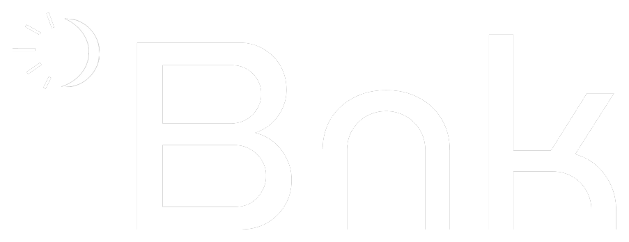
Logo
Our primary wordmark. Use the light version on dark backgrounds and the dark version on light backgrounds. Always preserve clear space around the mark equal to the height of the “i”.
Colors
Click any swatch to copy its hex value.
Gradients
Our signature coral-to-orange aura. Use it as a backdrop for hero sections, covers, and social assets — on a near-black or off-white canvas. Keep the glow soft and uncropped; never overlay dense text directly on the brightest area.


Typography
iBnk uses Sequel Sans across all brand surfaces, in Book, Medium, and Semibold weights.
Usage guidelines
A few simple rules to keep the brand consistent.
- Use the logo with adequate clear space
- Use approved brand colors
- Keep the wordmark legible on simple backgrounds
- Don’t stretch, rotate, or recolor the logo
- Don’t add effects, shadows, or outlines
- Don’t place the logo on busy or low-contrast backgrounds
Press & partnerships
Need additional assets, logos in other formats, or have a media request? Email contact@ibnk.xyz and we’ll get back to you.